How to Optimize Images for Faster Loading: The Definitive Guide to Web Performance
In the modern digital landscape, speed is not just a luxury—it is a fundamental requirement for success. As websites become increasingly visual, the weight of image assets has ballooned, often accounting for more than 60% of a total webpage’s size. If these images are not properly optimized, they become digital anchors, dragging down load times, frustrating users, and penalizing your visibility in search engine results.
This guide provides a comprehensive deep dive into the technical and strategic aspects of image optimization. We will explore how to balance visual fidelity with file size, ensuring your website remains lightning-fast without sacrificing the aesthetic quality your brand requires.
Read: PPC v/s Organic SEO: Which One is Your Pick of the Day?
Why Image Optimization is Important
The impact of image optimization ripples across every facet of a website’s performance. When a user navigates to your URL, their browser must download every byte of data before the page is fully functional. Large, unoptimized images force the browser to spend excessive time fetching data, leading to a “staggered” loading experience that drives users away.
The Connection to SEO and Core Web Vitals
Search engines have made it clear that page speed is a ranking factor. Specifically, through metrics like Core Web Vitals, performance is quantified by three key areas that image optimization directly influences:
Largest Contentful Paint (LCP): This measures how long it takes for the largest element on the screen (often a hero image) to become visible. High-resolution, heavy images are the primary cause of poor LCP scores.
Cumulative Layout Shift (CLS): If images are loaded without defined dimensions, the text around them will jump or shift once the image finally renders. This creates a jarring user experience that search engines penalize.
First Input Delay (FID): While less direct, heavy image processing can clog the browser’s main thread, making the page feel unresponsive to clicks or scrolls.
Read: Boost Your Rankings: SEO Link Building in 4 Easy Steps
User Experience and Conversion Rates
Data from various industry leaders consistently shows that a one-second delay in page load time can lead to a significant reduction in conversions. For e-commerce sites, where high-quality imagery is vital for sales, the stakes are even higher. Users expect a seamless transition between pages; if your product photos take several seconds to “pop” into view, the perceived professionality of your site drops instantly.
Bandwidth and Accessibility
Optimization is also a matter of inclusivity. Not every user has access to high-speed fiber internet. Users on mobile devices in areas with limited connectivity, or those with restricted data plans, are disproportionately affected by heavy websites. By reducing image weight, you ensure your content is accessible to a global audience regardless of their hardware or data constraints.
Read: Link Exchange For Blogs – Types, Benefits, and the DOs and DON’Ts
Choosing the Right Image Format
Selecting the correct file format is the first and most impactful decision in the optimization process. Each format uses different mathematical algorithms to store visual data, making some better for photographs and others better for icons or logos.
Traditional Formats
JPEG (Joint Photographic Experts Group): The gold standard for complex photographs and gradients. JPEG uses lossy compression, which means it discards some data to reduce size. It is excellent for rich colors but struggles with sharp edges and text, which can become blurry.
PNG (Portable Network Graphics): A lossless format, meaning no data is lost during compression. PNG is the go-to for images requiring transparency or those containing text and sharp geometric shapes. However, PNG files are significantly larger than JPEGs for photographic content.
Modern and Next-Gen Formats
WebP: Developed by Google, WebP supports both lossy and lossless compression. It typically provides 25-35% smaller file sizes than JPEG at equivalent quality. It also supports transparency, making it a versatile replacement for both JPEG and PNG.
AVIF (AV1 Image File Format): The newest contender in the space. AVIF offers even better compression than WebP, often reducing file sizes by 50% compared to JPEG. While browser support was initially slow, it is now widely supported in modern environments.
Format Comparison Table
| Format | Compression Type | Best Use Case | Transparency? |
| JPEG | Lossy | High-detail photographs | No |
| PNG | Lossless | Logos, icons, screenshots | Yes |
| WebP | Both | General web use (all-rounder) | Yes |
| AVIF | Both | Maximum compression efficiency | Yes |
| SVG | Vector | Simple icons and illustrations | Yes |
Resize Images Before Uploading
One of the most common mistakes in web development is uploading a 4000-pixel wide image from a camera only to display it in a 400-pixel wide box on a website.
Display Size vs. Actual Size
When you upload an oversized image and use CSS or HTML attributes to “shrink” it, the user’s browser still has to download the full-sized file before resizing it locally. This is a massive waste of bandwidth. You should always crop and resize your images to the maximum dimensions they will actually appear on the screen.
Max Width Guidelines
For most standard websites, an image rarely needs to be wider than 1920 pixels (standard Full HD width). Even for full-width hero sections, 2560 pixels is usually the upper limit for 2K displays. For blog images or sidebar content, 800 to 1200 pixels is often more than enough.
Multiple Sizes for Different Devices
Through a technique called “Responsive Images,” you can generate several versions of the same image at different widths. This allows the browser to intelligently pick the smallest version that still looks sharp on the user’s specific screen.
Image Compression Techniques
Compression is the process of reducing file size by either removing unnecessary metadata or simplifying the actual pixel data.
Lossy Compression
Lossy compression permanently removes some data from the file. This is most effective for photographs where the human eye cannot easily distinguish between minor color variations. By stripping away these imperceptible details, file sizes can be reduced by 70-80%. The goal is to find the “sweet spot” where the file size is small, but no visible artifacts appear.
Lossless Compression
Lossless compression reduces file size without any loss in quality. It works by optimizing the way data is stored within the file. While safer for high-end graphics or images with text, the savings are much smaller, usually in the range of 5-20%.
Recommended Compression Levels
For JPEGs, a quality setting of 60-80% is usually ideal.
For WebP, a setting of 75-85% provides an excellent balance.
Always strip “EXIF” data (the camera model, GPS coordinates, and date taken) as this metadata can add several kilobytes to every image for no visual benefit.
Lazy Loading Images
Lazy loading is a technique that delays the loading of images until they are about to enter the user’s viewport (the visible part of the screen). Instead of downloading 20 images on a long blog post all at once, the browser only downloads the top few. As the user scrolls down, the next images are fetched just in time.
Native Lazy Loading
Modern browsers now support native lazy loading with a simple HTML attribute:
img src="image.jpg" loading="lazy" alt="Description"
When Not to Use Lazy Loading
Crucially, you should never lazy load “above-the-fold” images—the ones a user sees immediately upon landing. Doing so will delay the rendering of your most important visual elements and hurt your performance scores. Only apply lazy loading to images that are naturally hidden behind a scroll.
Responsive Images (srcset and sizes)
In the past, developers served one image to everyone. Today, with the massive variety of screen sizes—from tiny smartphones to massive 4K monitors—this is no longer viable. The srcset attribute allows you to list multiple versions of an image and tell the browser how wide each one is.
Benefits for Mobile Users
Mobile users often browse on smaller screens with higher pixel densities. Serving a massive desktop-sized image to a mobile phone is a waste of resources. Using srcset ensures that a phone only downloads a 400px or 800px wide version, saving significant battery life and data.
Use of CDNs for Image Delivery
A Content Delivery Network (CDN) is a global network of servers that store copies of your images. When a user in Tokyo visits your website hosted in New York, the CDN serves the images from a server in Tokyo rather than making the data travel across the world.
Image-Specific CDNs
Services like Cloudinary or ImageKit go a step further. They don’t just deliver the image; they optimize it on the fly. They can automatically detect the user’s browser and serve a WebP version instead of a JPEG, or resize the image based on URL parameters. This removes the manual labor of creating different versions of every photo.
Image Optimization Tools
Optimizing images doesn’t have to be a manual chore. There are tools for every level of technical expertise.
Online Tools
Squoosh: A web-based tool that lets you compare different formats and compression levels side-by-side.
TinyPNG: The most popular drag-and-drop compressor for bulk images.
CMS Plugins
ShortPixel / Smush: These automatically compress and convert images to WebP as you upload them to platforms like WordPress.
Developer Tools
ImageMagick: A powerful command-line tool for processing thousands of images at once.
Sharp: A high-performance library used for resizing and converting images in web applications.
Modern Techniques & Advanced Optimization
For those looking to achieve the absolute best performance scores, advanced techniques are required.
Next-Gen Formats and Adaptive Serving
Using the picture element allows you to provide multiple formats to the browser. You can list an AVIF version first, a WebP version second, and a standard JPEG as a fallback for older browsers. This ensures that every user gets the best format their device can handle.
AI-Based Compression
Newer algorithms use neural networks to identify which parts of an image are “important” (like a human face) and keep them sharp, while applying much heavier compression to “unimportant” areas (like a blurred background).
Testing & Measuring Performance
Optimization is an iterative process. You need to measure your progress to see what is working.
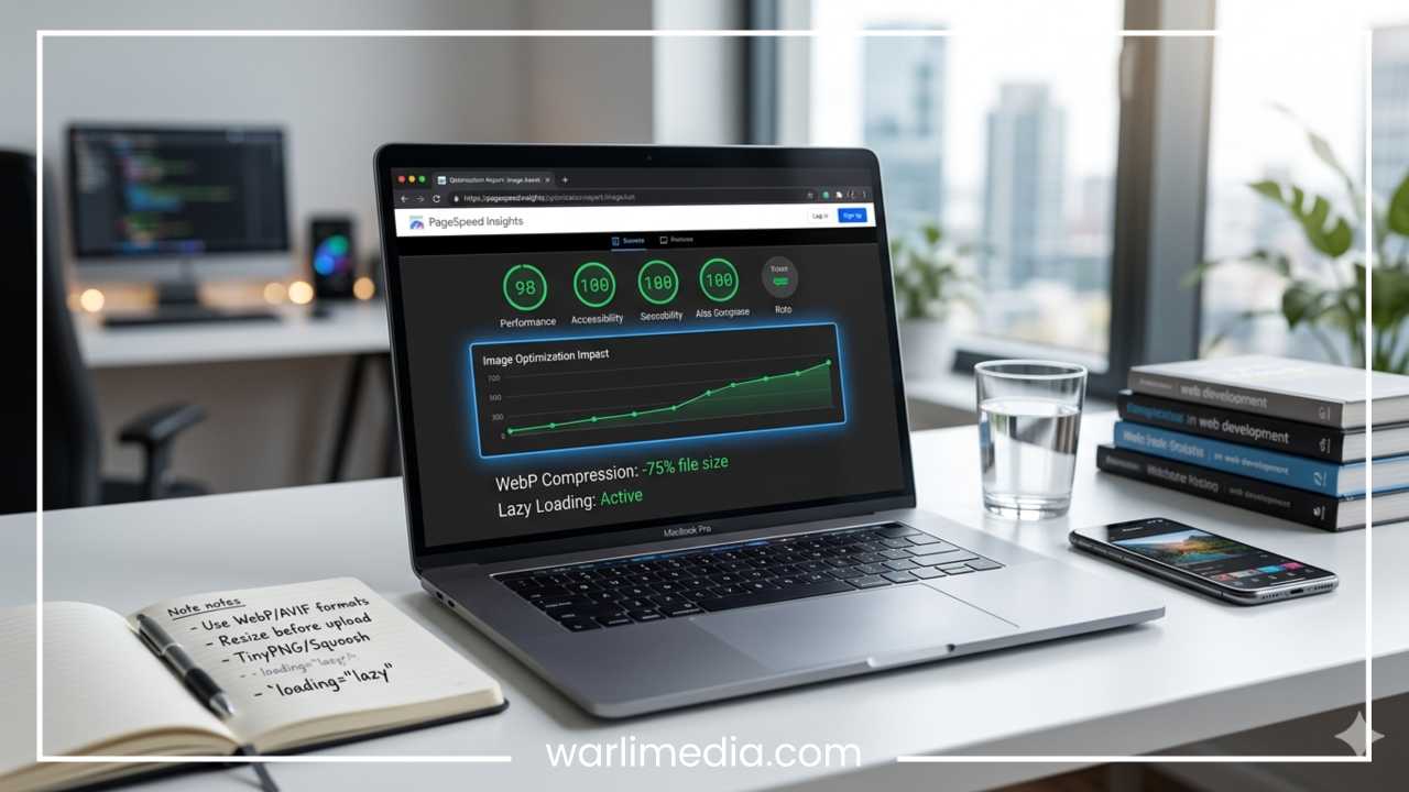
Google PageSpeed Insights: This provides a specific list of “Opportunities,” such as “Serve images in next-gen formats.”
Lighthouse: Built directly into browsers, it allows you to run audits locally as you develop.
GTmetrix: Provides a waterfall chart that shows exactly how long each image takes to download.
Common Mistakes to Avoid
Uploading Full-Resolution Images: Cameras produce files that are far too large for the web. Always downscale.
Ignoring Mobile Optimization: Speed on mobile is often more critical than on desktop due to varying signal strengths.
Over-Compressing Images: If images look “crunchy” or pixelated, you have gone too far.
Forgetting Alt Text: Optimization isn’t just about speed; it’s about accessibility and SEO.
Best Practices Checklist
Use WebP or AVIF as your primary formats.
Compress images to a quality level of 70-80%.
Resize images to their actual display dimensions.
Use lazy loading for images below the fold.
Serve images via a CDN for global speed.
Deep Dive: Understanding Bit Depth and Color Profiles
When we talk about optimizing images, we often focus on the physical dimensions (width and height), but the internal data structure of the file matters just as much. Bit depth refers to the amount of color information stored in an image. Most web images are 8-bit, which allows for 256 shades of red, green, and blue, totaling 16.7 million colors.
While professional photographers often work in 16-bit to avoid “banding” in gradients, 16-bit files are massive and entirely unnecessary for web browsers, which generally cannot display that extra data anyway. Converting your images to 8-bit and ensuring they use the sRGB color profile (the standard for the web) ensures consistency across different screens and prevents unexpected file bloat.
The Role of Vector Graphics (SVG)
While this guide focuses heavily on raster images (pixels), it is impossible to discuss optimization without mentioning SVGs (Scalable Vector Graphics). SVGs are not made of pixels; they are made of mathematical paths. This makes them infinitely scalable without losing quality and, more importantly, incredibly small in file size.
For logos, icons, and simple illustrations, SVGs should be your first choice. Because they are essentially XML code, they can be gzipped on the server, resulting in images that are often only a few hundred bytes. Furthermore, SVGs can be styled with CSS and animated with JavaScript, offering a level of flexibility that JPEGs or PNGs simply cannot match.
Impact of Image Optimization on Server Costs
Beyond user experience and SEO, there is a very practical financial reason to optimize: server and bandwidth costs. If your website serves 1,000 visitors a day and your homepage has 5MB of unoptimized images, you are transferring 5GB of data daily. If you optimize those images down to 1MB, you reduce your bandwidth usage to 1GB. For high-traffic websites, this reduction can save hundreds or thousands of dollars in hosting fees every year. It also reduces the carbon footprint of your digital infrastructure, making your business more sustainable.
Strategic Caching for Images
Caching is a mechanism that stores copies of your images on the user’s local device so they don’t have to be re-downloaded on subsequent visits. By setting “Expires” headers or “Cache-Control” policies for your images, you can tell the browser to keep an image for a month or even a year.
For images that rarely change—like your company logo or a profile picture—long-term caching is essential. This makes the second and third page views on your site feel instantaneous, as the browser pulls the images directly from the user’s hard drive rather than the internet.
Handling Retina and High-DPI Displays
High-DPI (often called Retina) displays have twice as many pixels in the same physical space. To keep images looking sharp on an iPhone or a modern MacBook, you technically need to serve an image that is twice the resolution of the display area. However, serving 2x images to everyone would double your page weight.
The solution is using the srcset attribute mentioned earlier with the 2x descriptor. This tells the browser: “If the user has a high-density screen, use this high-res image; otherwise, stick to the standard one.” This “best of both worlds” approach ensures quality for high-end devices without penalizing users on standard hardware.
Automating the Pipeline
For large-scale websites, manual optimization is impossible. Modern development workflows incorporate “Build Steps” using tools like Gulp, Webpack, or Vite. These tools can be configured to automatically take a folder of high-resolution source images and, upon every deployment, output a folder of resized, compressed, and WebP-converted versions.
By automating the optimization pipeline, you ensure that no unoptimized image ever makes it to your live server, even if a content editor forgets to run a file through a compressor. This “set it and forget it” approach is the hallmark of a professional, high-performance web architecture.
The Psychological Impact of Perceived Speed
Finally, it is worth noting that image optimization isn’t just about raw numbers—it’s about “perceived” speed. Using techniques like “Blur-up” (where a tiny, blurry version of the image loads instantly while the high-res version downloads in the background) or “Progressive JPEGs” (which load a grainy version of the whole image first and then gradually sharpen) makes the user feel like the site is faster.
When a user sees something appearing immediately, they are much more likely to wait for the full quality to arrive than if they are staring at a blank white box. By combining technical optimization with these visual loading strategies, you create a browsing experience that feels robust, reactive, and professional.
Final Thoughts
Image optimization is the most effective “low-hanging fruit” in web performance. Unlike complex server-side optimizations, image optimization is straightforward and provides immediate, measurable results. By choosing the right formats, resizing appropriately, and utilizing modern delivery techniques, you can dramatically improve your site’s speed. This results in happier users, better search rankings, and a more successful digital presence. Audit your site today and see how much faster your pages can load.


 and Its Impact on SEO")


")