
What is Mobile-First Indexing?
The landscape of the internet has undergone a monumental transformation. In the early days of the World Wide Web, web designers and developers crafted digital experiences exclusively for desktop monitors. Websites featured complex layouts, multi-column navigation systems, and heavy graphical elements designed to be viewed on large displays connected to high-speed broadband or dial-up connections. Handheld internet browsing was nothing more than a futuristic concept.
Today, the reality is entirely reversed. The majority of global web traffic originates from mobile devices. Smartphones and tablets have become the primary windows through which humanity accesses information, shops, connects, and consumes media. This profound shift in user behavior fundamentally changed search engine optimization (SEO) and web development.
As users transitioned away from desktop computers, search engines had to evolve to match this behavior. Google realized that evaluating websites based on their desktop performance no longer served its users. If a search engine evaluates a website based on its desktop layout but a user accesses that same site via a smartphone and encounters a broken, slow, or unreadable page, the search experience fails.
To bridge this gap, Google introduced mobile-first indexing. This shift changed how search systems evaluate, catalog, and rank content across the web. Today, most searches happen on mobile devices, so Google primarily evaluates the mobile version of websites when deciding rankings. Understanding this concept is no longer optional for businesses, developers, or SEO professionals; it is the absolute foundation of modern visibility online.
Read: 15 Best SEO Plugins for WordPress
What Is Mobile-First Indexing?
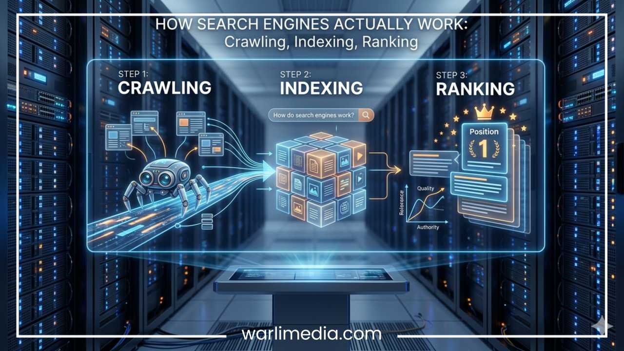
To truly understand mobile-first indexing, one must first break down the technical process Google uses to organize information. The process of delivering search results involves three distinct steps: crawling, indexing, and ranking.
Crawling: This is the discovery stage. Google deployment software, known as web crawlers or bots, systematically scans the internet, following links from page to page to discover new and updated content.
Indexing: Once a page is crawled, Google processes and analyzes its textual content, structural markup, and media assets. If the page meets quality standards, it is saved in a massive database known as the Google Index.
Ranking: When a user types a query into the search engine, Google algorithms instantly search the index to retrieve the most relevant, high-quality pages, displaying them in order of importance and utility.
Historically, Google used a desktop-first approach. The crawler, simulating a desktop browser, would evaluate the desktop version of a page to determine its relevance. Whatever content, structured data, and internal links were visible on that desktop version became the basis for how the page was indexed and ranked.
Mobile-first indexing completely reverses this hierarchy. Under this paradigm, Google primarily uses the mobile version of a website for indexing and understanding content. When Googlebot crawls a site, it does so using a smartphone user-agent. The text, images, videos, metadata, and structural elements rendered on the smartphone screen are what Google stores in its database.
It is highly critical to clarify a common misconception: Google does not create a separate mobile index. There is only one single index used to generate search results for both desktop and mobile users. The distinction lies entirely in which version of your site Google uses to populate that index. Instead of looking at your desktop site first and using your mobile site as a secondary reference, Google now looks at your smartphone site as the primary source of truth. If your mobile site lacks content that is present on your desktop site, that missing content may fail to be indexed entirely, directly damaging your search visibility across all devices.
Read: SEO vs. PPC: Differences, Pros, Cons, & Which to Choose
Why Did Google Introduce Mobile-First Indexing?
The catalyst for mobile-first indexing was the explosive growth of mobile internet usage. Over the span of a decade, smartphones transitioned from luxury communication devices to indispensable tools for daily life. As mobile hardware advanced and cellular networks transitioned to high-speed data protocols, consumer behavior shifted rapidly. People began executing searches on the go, looking for immediate answers, local businesses, and instant entertainment while away from their desks.
This behavior introduced a significant problem for search engines. Desktop-only websites or poorly optimized mobile platforms created poor mobile experiences. Users clicking through search results from their phones were frequently greeted with tiny text that required pinching and zooming, broken Flash elements, navigation buttons that were too small to tap accurately, and slow loading times that consumed mobile data.
Furthermore, a significant mismatch arose between search results and user expectations. Many webmasters employed a practice where they stripped down their mobile sites to save bandwidth or simplify mobile design, serving a comprehensive experience to desktop users but a bare-bones version to smartphone users. Because Google was still indexing the desktop version, these minimalist mobile pages ranked highly in search results. When a mobile user clicked the link, they discovered a weaker mobile page that lacked the depth, answers, or features promised by the desktop snippet in search results.
To establish consistency between search results and user experience, Google had to change its methodology. If a website’s mobile presence was what the user actually interacted with, then the mobile presence had to be what the search engine evaluated.
Google announced its initial plans for mobile-first indexing in late 2016. Recognizing that immediate enforcement would cause widespread disruption across the web, the search engine began a gradual rollout. It initially migrated websites that were fully prepared for the transition, expanding the process systematically over several years until mobile-first crawling became the default state for the web.
Read: How to Create an XML Sitemap (and Submit It to Google)
How Mobile-First Indexing Works
The execution of mobile-first indexing is a systematic process handled by Google’s automated infrastructure. Understanding this operational pipeline allows webmasters to better align their technical configurations with the search engine’s expectations.
Step 1: Googlebot Smartphone Crawling
The process begins with discovery. While Google maintains multiple variations of its crawler, its primary operational tool for standard web indexing is the Googlebot smartphone user-agent. This crawler simulates the rendering engine of a modern mobile device. When navigating to a URL, it requests the page exactly as a smartphone screen would, triggering any mobile-specific layouts, scripts, or responsive stylesheets.
Step 2: Content Evaluation
Once Googlebot smartphone successfully renders the page, the system performs a comprehensive analysis of the site’s architecture and assets. Google specifically checks:
Text: Ensure all primary written content, explanations, and long-form copy are fully visible in the mobile viewport.
Images: Evaluating asset file types, compression ratios, and responsive sizing properties.
Videos: Checking video placement, formatting, and compatibility with mobile players.
Structured Data: Ensuring schema markup remains present and intact within the mobile source code.
Metadata: Verifying title tags, meta descriptions, and robots directives match their desktop counterparts.
Internal Links: Assessing whether the site architecture remains intact, allowing links to pass equity effectively between pages on mobile views.
Step 3: Indexing
Following evaluation, the extracted data is processed and stored within Google’s unified index. The information gathered during the mobile crawl becomes the baseline data structure used by ranking algorithms to determine positions for relevant search queries.
To visualize this operational pathway simply:
| Stage | Process | Action Item |
| 1 | Mobile Website | Content is deployed on a responsive or mobile-friendly architecture. |
| 2 | Googlebot Smartphone | Google’s mobile crawler requests, renders, and reads the smartphone view. |
| 3 | Index | The rendered text, links, and media are filed away in Google’s primary database. |
| 4 | Search Rankings | The stored mobile data determines search positions across all devices. |
Mobile-First Indexing vs Mobile-Friendly Design
Among web developers and business owners, the terms “mobile-first indexing” and “mobile-friendly design” are frequently used interchangeably. This is an industry misconception. While the two concepts are deeply interconnected and support the same ultimate goal—a superior experience for smartphone users—they represent completely distinct mechanisms in the digital ecosystem.
Mobile-first indexing is an automated backend process executed by the search engine. It defines how Google collects, reads, and stores content. It is a technical indexing pipeline that dictates which version of a webpage’s HTML and asset architecture Google analyzes to populate its search directory.
Mobile-friendly design, by contrast, is a frontend user-experience methodology. It dictates how human users experience a website when they visit it. A mobile-friendly layout ensures text scales comfortably, menus fold away into accessible drawers, images resize dynamically, and interactive elements respond perfectly to touch inputs instead of mouse clicks.
Understanding this boundary yields an important truth: a website can be fully mobile-friendly from a visual standpoint but still suffer from severe indexing problems. Conversely, a website can be fully indexed via mobile-first mechanisms while offering a frustrating, poorly designed user experience.
For instance, consider a website that uses dynamic serving to display different content to mobile users. The designer may create a visually striking mobile page that is highly mobile-friendly, featuring rapid load speeds and large tap targets. However, if the development team accidentally strips out the primary text content, structured schema markup, or vital header tags from that mobile view to keep the layout minimalist, the page fails the requirements of mobile-first indexing. Googlebot smartphone will crawl the page, note the lack of substantial content, and lower its rankings in the primary index, despite its excellent mobile usability.
Impact of Mobile-First Indexing on SEO
The shift to prioritizing mobile views has changed the rules of Search Engine Optimization. If a website’s mobile configuration is flawed, its visibility across all organic search channels—including desktop searches—is put at risk.
Content Differences Between Desktop and Mobile
Historically, designers minimized mobile layouts by hiding substantial portions of text behind accordion menus, tabbed interfaces, or by removing long paragraphs entirely. In the desktop-first era, this was an acceptable compromise because Google still indexed the complete desktop version.
Under mobile-first indexing, hidden or missing mobile content can significantly affect rankings. If critical information, product descriptions, blog content, FAQs, or customer reviews do not exist on the mobile version of a page, Googlebot smartphone will not find them. Consequently, the search engine treats that missing content as if it does not exist on the website at all. Every piece of high-value information required to answer a user’s search intent must be preserved within the mobile source code.
Structured Data
Schema markup and structured data provide search engine bots with explicit clues about the meaning of a page, enabling the generation of rich snippets, star ratings, and enhanced search results.
[Desktop Site with Schema] --> (Ignored for primary indexing)
[Mobile Site missing Schema] --> Googlebot Smartphone reads this --> No Rich Snippets in SERPs
When migrating or maintaining configurations, technical teams must ensure that all structured data code blocks are mirrored perfectly across both the desktop and mobile versions. If mobile pages lack this markup, the site risks losing its eligibility for visually rich search results, which can cause a drop in organic click-through rates.
Images and Videos
Media optimization requires a fine balance under a mobile-first paradigm. Googlebot smartphone checks for high-quality, descriptive image asset deployments. If mobile configurations serve heavily degraded thumbnail assets instead of full-resolution images, image search visibility declines. Furthermore, all image alt attributes, descriptive file names, and video transcriptions must remain accessible in the mobile layout. Videos must be embedded using mobile-responsive containers to ensure they do not overflow the viewport or fail to load on mobile browsers.
Internal Linking
The internal architecture of a website distributes link equity (ranking power) throughout individual pages. On desktop designs, sidebars and expansive mega-menus provide robust paths for crawlers to discover deep-tier pages. When adapting layouts for smartphone displays, developers frequently remove sidebars and condense menus to save screen space. If these changes remove essential internal links from the mobile view, Googlebot smartphone may struggle to discover deeper pages, causing a decline in crawl frequency and keyword authority for those hidden sections.
Responsive Design and Mobile-First Indexing
To align with mobile-first indexing, modern web development relies on specific structural frameworks. How a site manages its multi-device deployment plays a massive role in technical stability.
Responsive Web Design
Responsive web design is the industry standard and the framework explicitly recommended by Google. In a responsive setup, the server sends the exact same HTML code to all devices, and the layout changes dynamically using CSS Media Queries. The web page detects the viewport width of the device requesting it and scales text, wraps columns, and resizes images accordingly.
Benefits: Because the underlying HTML codebase is identical for both desktop computers and smartphones, there is zero risk of content mismatch. The same text, structured data, internal links, and metadata are served to both humans and Googlebot smartphone. This makes site maintenance simpler and minimizes technical indexing errors.
Dynamic Serving
Dynamic serving utilizes a single URL for a page but alters the HTML and CSS delivered to the client based on the user-agent string detected by the server. When a desktop browser requests the page, the server delivers desktop-tailored code; when a smartphone requests it, the server generates a different batch of code.
While functional, dynamic serving introduces a high margin of error. It requires continuous server-side maintenance to recognize new mobile user-agent strings. If the server misidentifies Googlebot smartphone as a desktop browser, or if the development team fails to perfectly synchronize content updates across both code variants, indexing discrepancies can quickly emerge.
Separate Mobile URLs (m.example.com)
The use of separate mobile URLs—frequently referred to as an “m.dot” configuration—is an older web development approach. In this system, the site maintains two entirely separate sets of URLs: [www.example.com](https://www.example.com) for desktop users and m.example.com for mobile users. The server uses bidirectional redirection and switchboard tags (rel="canonical" and rel="alternate") to guide users and bots to the appropriate destination based on device type.
This approach creates significant technical complexity under mobile-first indexing. It requires flawless implementation of conditional mapping rules across thousands of pages. If synchronization issues occur, or if mobile pages lack the content depth of the desktop variants, search visibility can drop. Because maintaining two separate websites requires substantial time and resources, this method has largely been phased out in favor of responsive web design.
Mobile-First Indexing Best Practices
Achieving excellence in mobile SEO requires a proactive approach to engineering and content management. Below are the key strategies needed to keep your site visible and highly ranked.
1. Ensure Mobile and Desktop Content Match
The primary directive of mobile-first indexing is content parity. Audit your mobile layout to guarantee that your core messaging is consistent across all versions:
Primary Content: Ensure long-form text, product details, tables, and instructional guides are identical across views.
Headings: Use identical
<h1>through<h6>structures on mobile and desktop pages to provide clear contextual signals.Metadata: Keep title tags and meta descriptions matching word for word across device presentations.
2. Improve Mobile Page Speed
Mobile devices often operate on slower, higher-latency cellular networks compared to desktop computers. Therefore, mobile speed optimization directly impacts search outcomes. Webmasters should leverage server caching protocols, eliminate render-blocking JavaScript files, minify CSS style documents, and utilize Content Delivery Networks (CDNs) to reduce the physical distance between data packets and mobile users.
3. Use Responsive Design Principles
Build your site using fluid grid systems that use percentages rather than fixed pixel dimensions. Ensure typography scales dynamically, keeping body fonts at a readable minimum size (typically 16px) without requiring manual zoom. Design interactive elements with adequate padding around them to prevent accidental mistaps on smaller touchscreens.
4. Optimize Images
Images are often the primary cause of slow loading times on mobile devices. To optimize them effectively:
Modern Formats: Serve images using next-generation formats like WebP or AVIF, which offer superior compression compared to traditional JPEG or PNG files.
Compression: Apply lossy or lossless compression algorithms to reduce file sizes without sacrificing visual clarity.
Correct Sizing: Use the
srcsetattribute within your HTML code to serve appropriately scaled image variants depending on the user’s screen dimensions.Lazy Loading: Implement native lazy loading (
loading="lazy") to delay the rendering of below-the-fold media assets until the user scrolls near them.
5. Make Navigation Mobile-Friendly
Condense complex desktop headers into streamlined navigation systems, such as clean hamburger menus. Integrate predictive, accessible internal search features to help users find deep-tier pages quickly. Finally, eliminate intrusive interstitials, large overlay banners, or sudden popups that block the primary content viewport, as these elements frustrate users and can incur search engine layout penalties.
6. Check Mobile Usability
Regularly audit your platform using modern diagnostic suites. Evaluate real-world technical health using performance testing environments like Google Lighthouse and PageSpeed Insights, which provide clear, actionable feedback on script execution times and rendering performance.
Common Mobile-First Indexing Issues
Even experienced technical teams can encounter roadblocks when optimizing for mobile-first indexing. Identifying and resolving these challenges quickly is essential for protecting your organic traffic.
Issue 1: Missing Mobile Content
This issue arises when a desktop page features complete guides, expanded reviews, or detailed specifications, while its mobile counterpart shows only an abbreviated summary.
Solution: Redesign the mobile presentation layer using collapsible accordion elements or tabbed menus if visual clutter is a concern. Google explicitly states that content hidden inside tabs or accordions for UX purposes on mobile pages is fully indexed and weighted normally, unlike similar practices on desktop designs.
Issue 2: Blocked Mobile Resources
Sometimes, old configurations inside a site’s robots.txt file accidentally instruct search engine crawlers to ignore critical assets, such as specific CSS folders, JavaScript files, or image directories.
Solution: Review your
robots.txtconfiguration files to ensure that Googlebot smartphone has full permission to crawl all resource assets required to render your pages properly. If the bot cannot access these resources, it cannot accurately evaluate the layout and quality of your site.
Issue 3: Slow Mobile Performance
A page may load quickly on a fast office desktop computer, but stall out when loaded via a standard smartphone connection, resulting in a poor user experience.
Solution: Optimize the site’s critical rendering path by prioritizing the loading of above-the-fold content, deferring non-essential scripts, and aggressively compressing images.
Issue 4: Poor Mobile Navigation
When a site lacks clear text links or an accessible menu on mobile devices, crawlers and users alike struggle to navigate deep into the site’s hierarchy.
Solution: Implement a clear, intuitive site architecture with touch-friendly navigation options, ensuring every high-priority page can be reached within a few taps from the homepage.
Issue 5: Incorrect Mobile Redirects
On legacy separate mobile URL systems (“m.dot” configurations), desktop links sometimes accidentally point mobile visitors to a generic mobile homepage instead of the specific mobile equivalent of that exact page.
Solution: Audit all device redirection maps to ensure that every desktop URL redirects to its exact corresponding mobile URL, and vice versa.
How to Check If Your Website Uses Mobile-First Indexing
Because Google transitioned the web toward mobile-first crawling over an extended timeline, almost all established and newly launched websites are indexed via this method by default. However, verifying your site’s status provides peace of mind and confirms that your technical assumptions are correct.
The most direct way to check your status is through Google Search Console. Log in to your verified property dashboard and navigate to the “Settings” menu in the left-hand sidebar. Within the “About” box on this screen, Google explicitly displays the “Indexing crawler” assigned to your domain. If it lists Googlebot smartphone, your site has successfully migrated to mobile-first indexing.
Google Search Console -> Settings -> About -> Indexing Crawler: Googlebot Smartphone
For page-level verification, use the URL Inspection Tool located at the top of the Search Console interface. Paste a specific URL from your site into the search bar and allow the system to run its analysis. Expand the “Coverage” or “Page indexing” information sections in the resulting report to view the “Crawl” details. Here, you can see the designated user-agent that performed the latest successful live crawl. If it displays Googlebot smartphone, Google is evaluating that specific URL through its primary mobile lens.
Mobile-First Indexing and Core Web Vitals
The focus on mobile experiences connects directly with Google’s performance metrics known as Core Web Vitals. These user-centric metrics measure real-world user experience based on page loading speeds, interactivity, and visual stability.
Core Web Vitals Overview
| Metric | Full Name | Focus Area | Goal Target |
| LCP | Largest Contentful Paint | Loading Performance | Under 2.5 seconds |
| INP | Interaction to Next Paint | Page Interactivity | Under 200 milliseconds |
| CLS | Cumulative Layout Shift | Visual Stability | Score under 0.1 |
Mobile users frequently access the web under less-than-ideal network conditions, such as variable cellular signals or congested public Wi-Fi networks. A site that performs adequately on a desktop computer running on fiber-optic broadband can easily fail Core Web Vitals targets when rendered on a mid-range smartphone over a cellular network.
Because Google uses mobile data as the baseline for its indexing choices, your mobile Core Web Vitals scores directly shape your overall page experience signals. If elements shift around on screen during layout loading (high CLS) or if interactive elements lag when tapped (high INP) on mobile views, search engines will flag the experience as sub-optimal, which can lower your rankings in competitive search environments.
Future of Mobile-First SEO
The implementation of mobile-first indexing was not a final destination, but rather a foundational step toward a shifting digital landscape. Looking ahead, mobile search optimization continues to evolve alongside new technologies.
The integration of artificial intelligence into search results is changing how users consume information on handheld screens. AI-driven answer engines synthesize complex multi-source answers directly within the mobile viewport, making conversational text structure and clear content organization more critical than ever. Voice search usage also relies heavily on mobile indexing; when users dictate queries into smart assistants on the move, those systems pull immediate answers from the text snippets discovered by mobile crawlers.
Additionally, technologies like Progressive Web Apps (PWAs) continue to blur the lines between standard websites and native mobile applications. These platforms deliver app-like features—such as offline functionality, push notifications, and rapid load speeds—directly inside a mobile web browser. As user experience becomes the ultimate metric for online success, the sites that combine deep content, technical responsiveness, and rapid performance will win the future of search.
Final Thoughts
Mobile-first indexing represents a permanent shift in how search engines catalog human knowledge. By prioritizing the smartphone view of websites, Google aligned its internal evaluation mechanisms with the real-world behaviors of global internet users.
Succeeding in this ecosystem requires an ongoing commitment to technical excellence. Webmasters and content creators must move past the mindset of treating mobile optimization as a secondary task or a simplified adaptation of a desktop layout. To maintain and grow organic search visibility, your mobile website is your primary website.
Ensuring total content consistency, adopting responsive design, maximizing mobile loading speeds, and optimizing media assets are essential practices for modern SEO. By prioritizing the mobile experience, businesses protect their search rankings while delivering a fast, useful, and engaging experience to their target audience.
Frequently Asked Questions
Why is my desktop site ranking dropping after Google mobile-first indexing?
When Google transitions a site to mobile-first crawling, it switches its primary evaluation lens from your desktop layout to your smartphone layout. If your desktop site ranking is dropping, it usually points to a lack of content parity.
Many webmasters optimize their smartphone layouts by removing large text sections, hiding product descriptions, or dropping customer reviews to save space. Because Googlebot smartphone is now the primary crawler, any content missing from your mobile layout is treated as if it does not exist on your website at all. To restore your positions, audit your mobile site to ensure all text, header tags, images, and internal links perfectly match the desktop setup.
How to check if a website is mobile-first indexed by Googlebot smartphone?
The most reliable method to verify your indexing status is through Google Search Console.
Log into your dashboard and click on Settings in the left-hand navigation bar.
Look at the About section to find the Indexing crawler designation. If it lists Googlebot smartphone, your site is fully transitioned.
For individual pages, use the URL Inspection Tool at the top of the interface. Paste your URL, run the live check, and expand the Page indexing details to see which user-agent handled the most recent crawl.
Does mobile-first indexing affect desktop search results and keyword rankings?
Yes, mobile-first indexing directly dictates your performance on desktop search engine results pages (SERPs). Google uses a single, unified index to serve answers to both desktop and smartphone users.
Because the data in that unified index is populated primarily by crawling mobile versions of pages, a poorly optimized mobile site will lower your baseline authority. If your mobile layout has slow loading speeds, broken media elements, or missing structured data, your rankings will drop for both desktop and mobile searchers alike.
What happens if a desktop site is not mobile friendly under current Google guidelines?
If a website completely lacks a mobile-responsive or mobile-friendly layout, Googlebot smartphone will still crawl the standard desktop version of the HTML. While the page will remain in the index, it will face a significant competitive disadvantage.
A non-mobile-friendly layout fails to meet modern page experience standards. It will struggle to pass Core Web Vitals assessments due to text scaling issues and sizing errors, leading to lower rankings in organic search results.
How to fix missing structured data on mobile pages for rich snippet visibility?
Missing structured data occurs most frequently on websites that use separate mobile URLs or dynamic serving configurations. To fix this and protect your rich snippets, you must ensure that your schema markup code is served identically to all devices.
If you use responsive web design, this issue is automatically resolved because the underlying HTML remains identical. For other setups, use tools like Lighthouse to inspect the generated source code on a mobile user-agent, verifying that all organizational, article, or product schema blocks are fully present in the smartphone output.
Is responsive web design required for successful Google mobile optimization?
Responsive web design is not strictly required, but it is highly recommended by Google. You can achieve successful indexing using dynamic serving or separate mobile URLs, provided your execution is flawless.
However, responsive web design remains the safest option for SEO. Because it uses a single URL and a single set of HTML code across all devices—relying purely on CSS to adjust layouts—it eliminates the risk of missing content, mismatched metadata, or incorrect URL redirections.